PORTUS
BRAND STRATEGY + BRAND NARRATIVE
Visual Identity
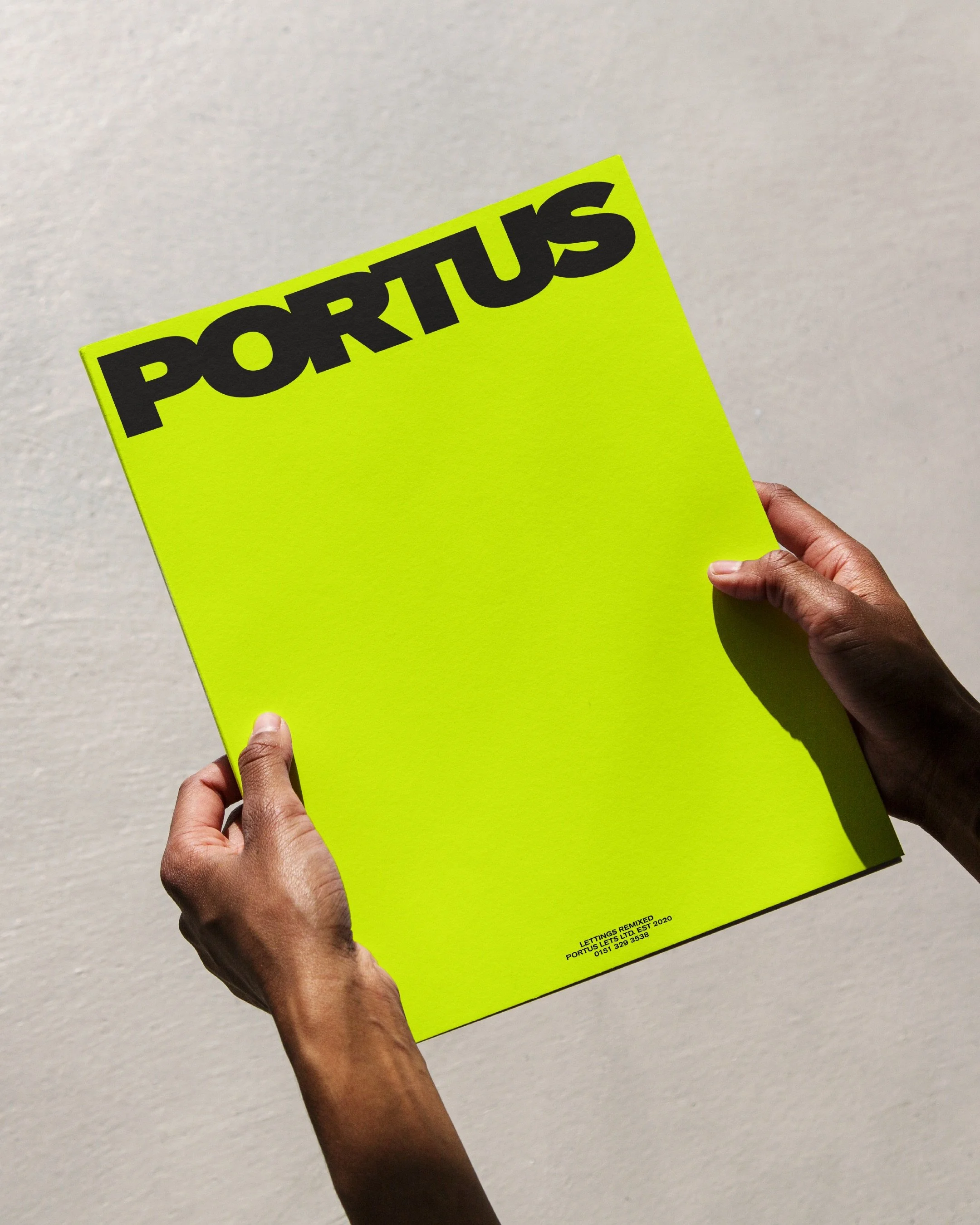
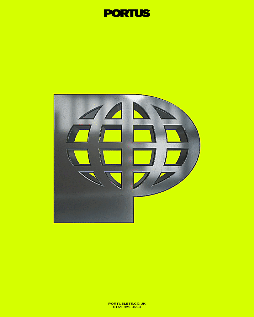
logo design
monogram design
ANIMATION
TYPOGRAPHY
COLOUR PALETTE
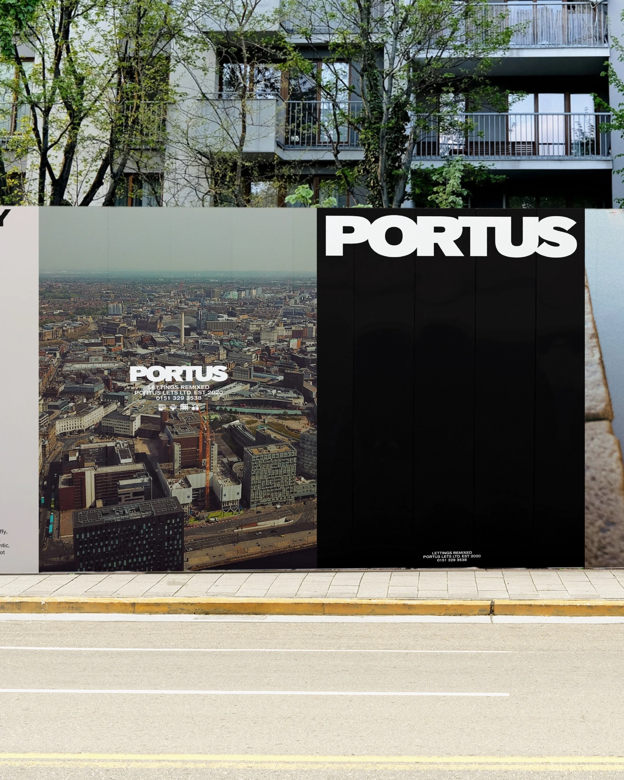
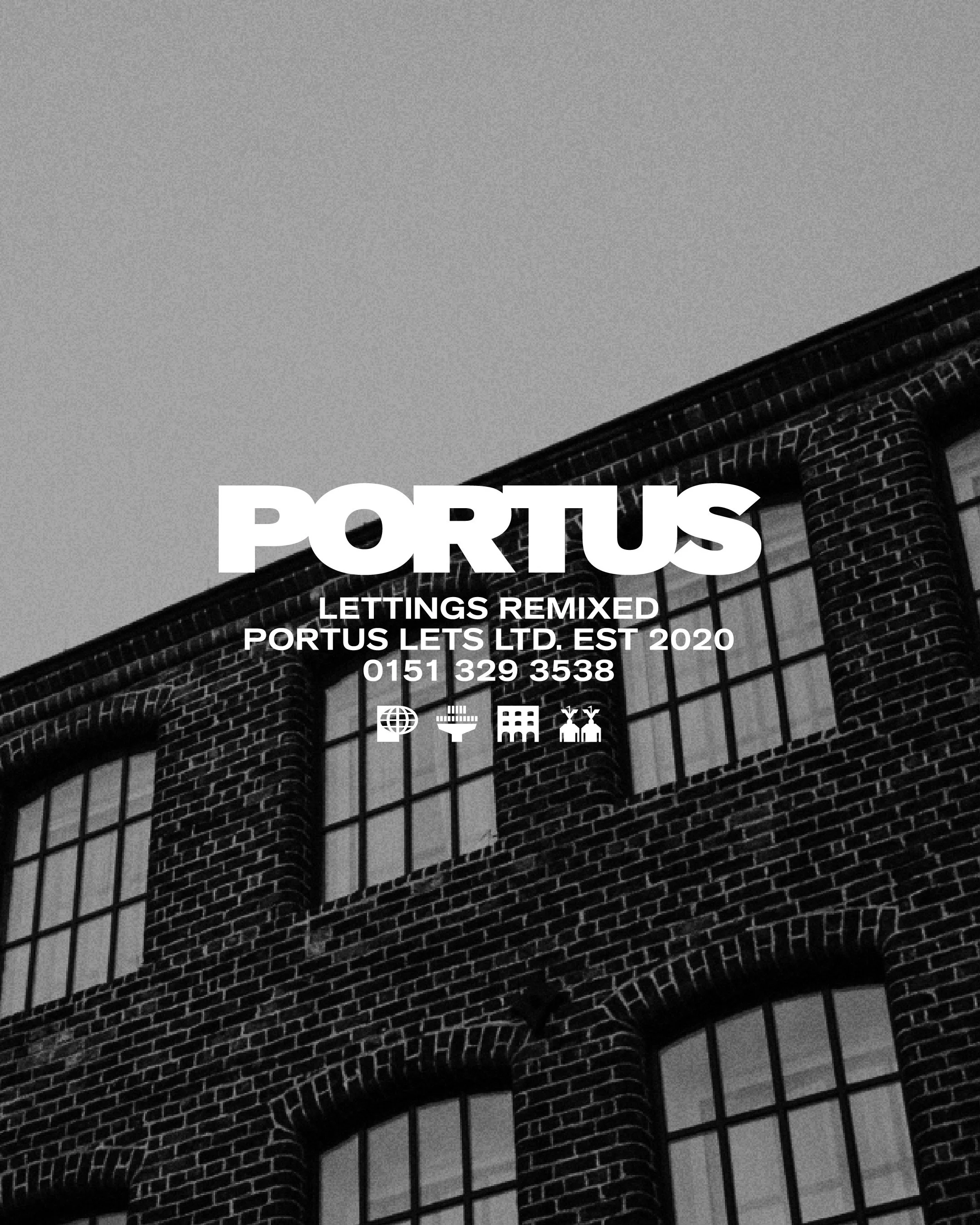
ART DIRECTION
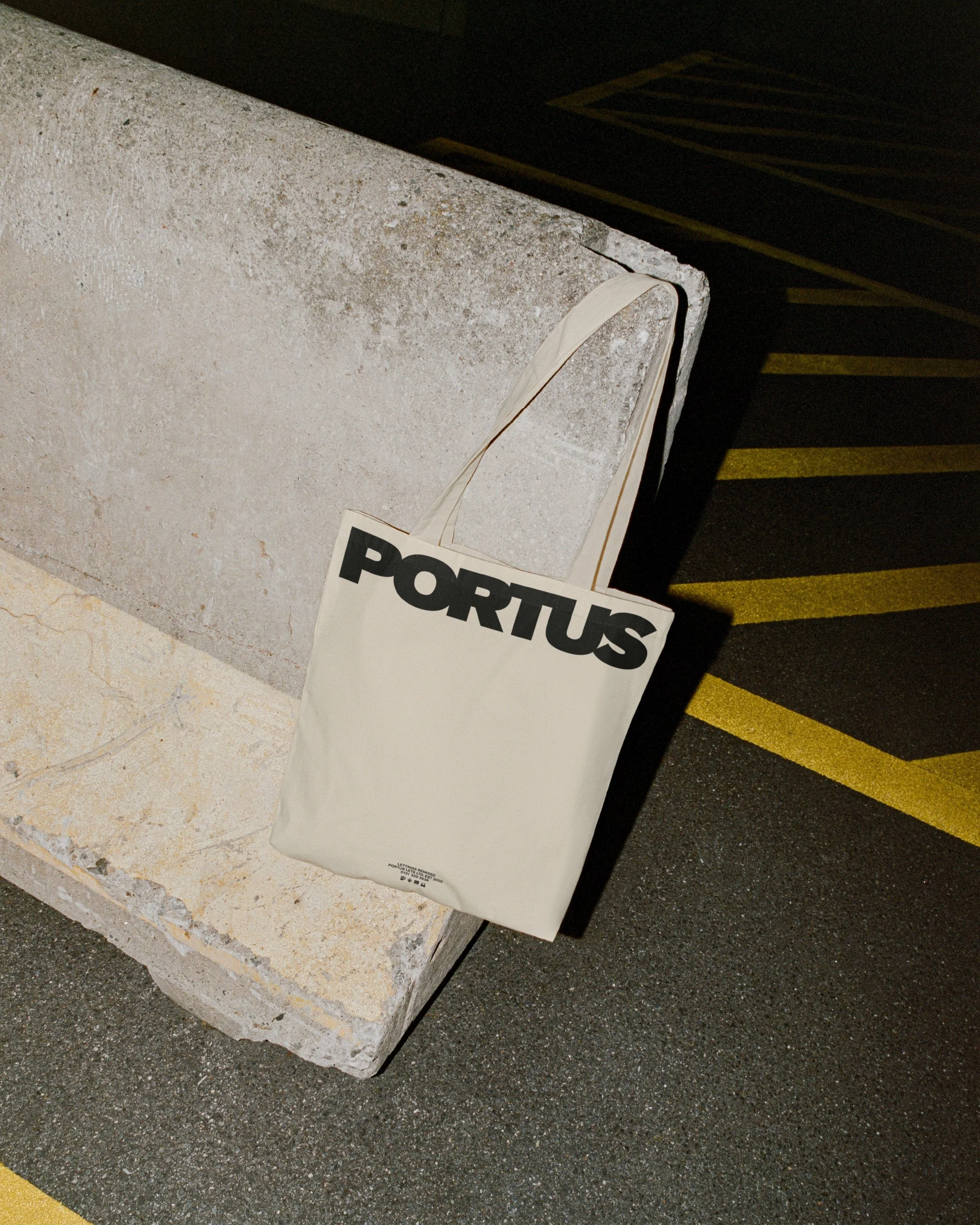
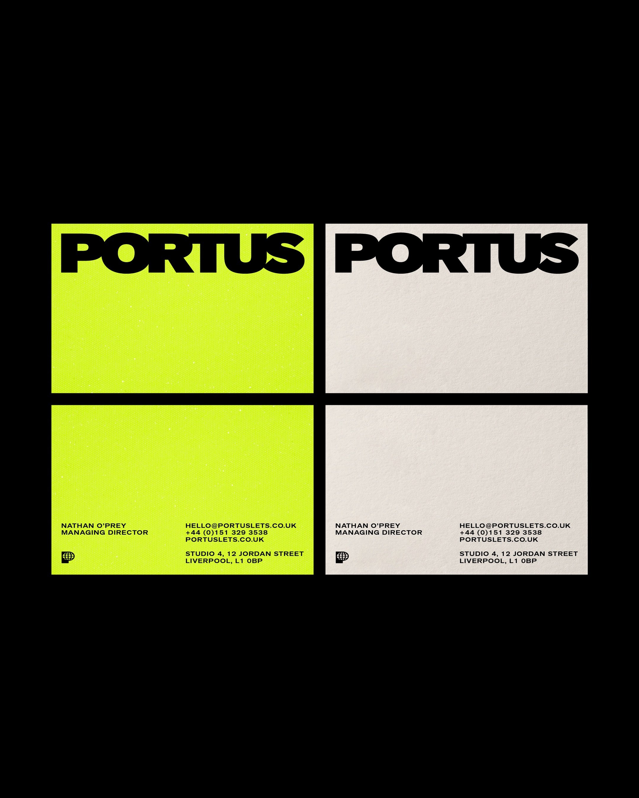
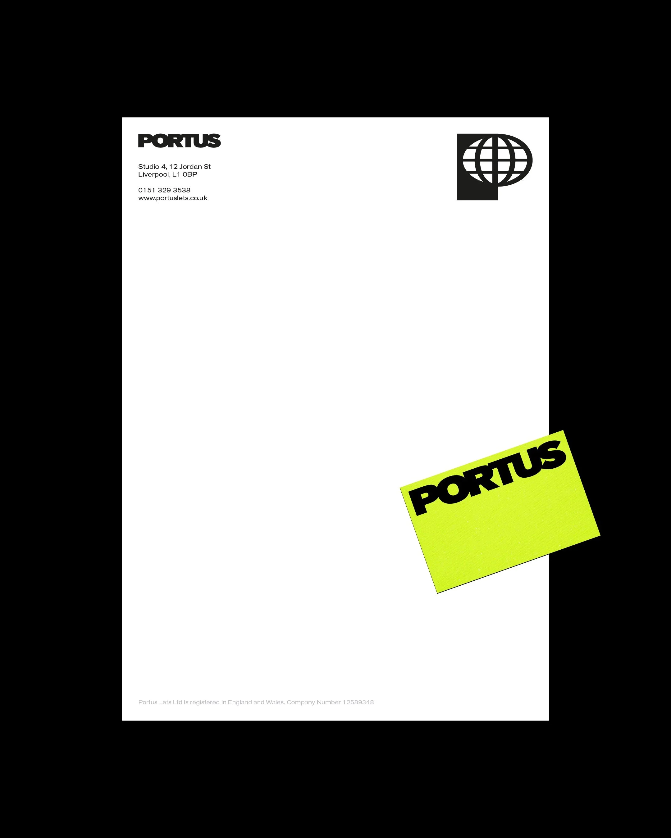
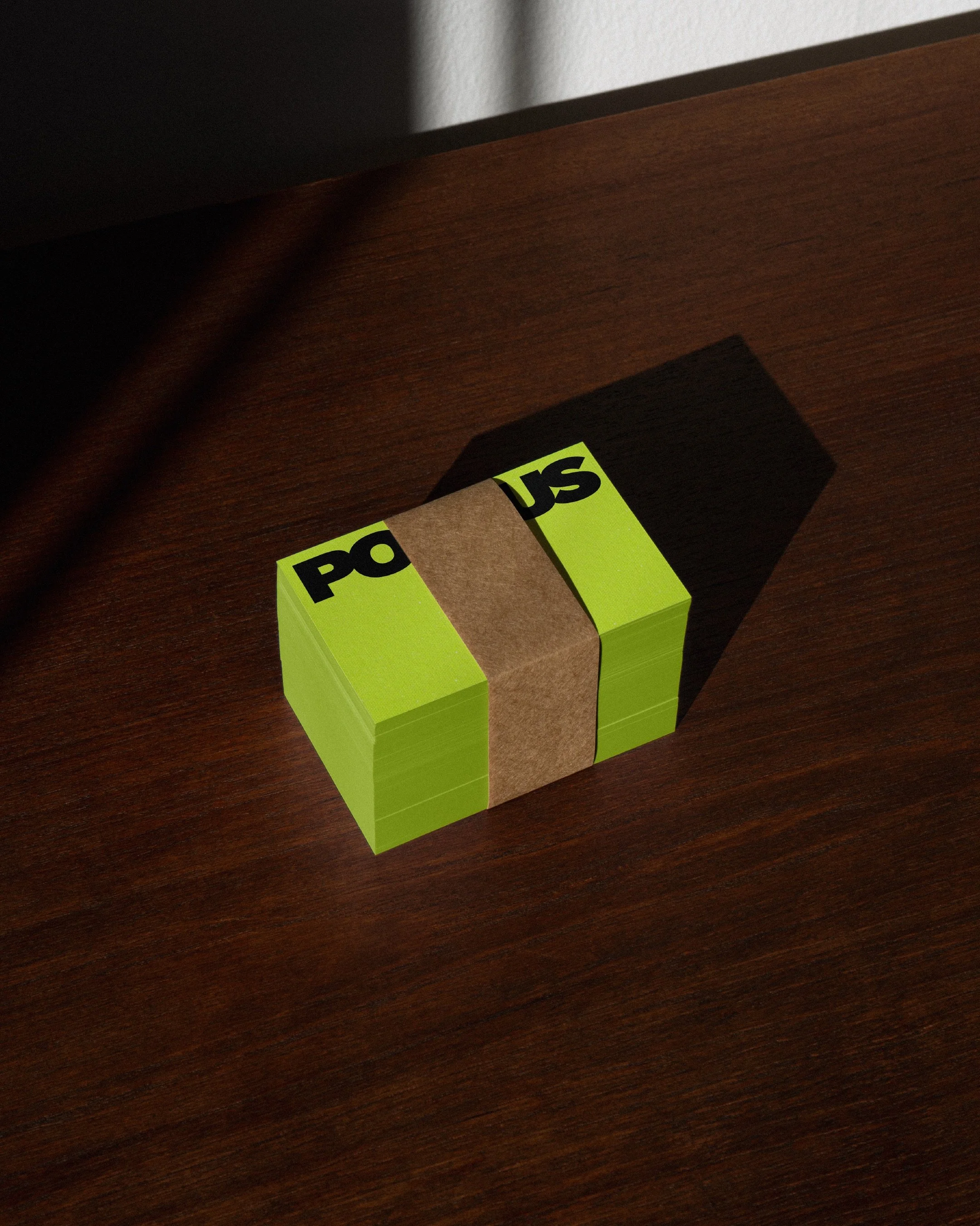
STATIONERY
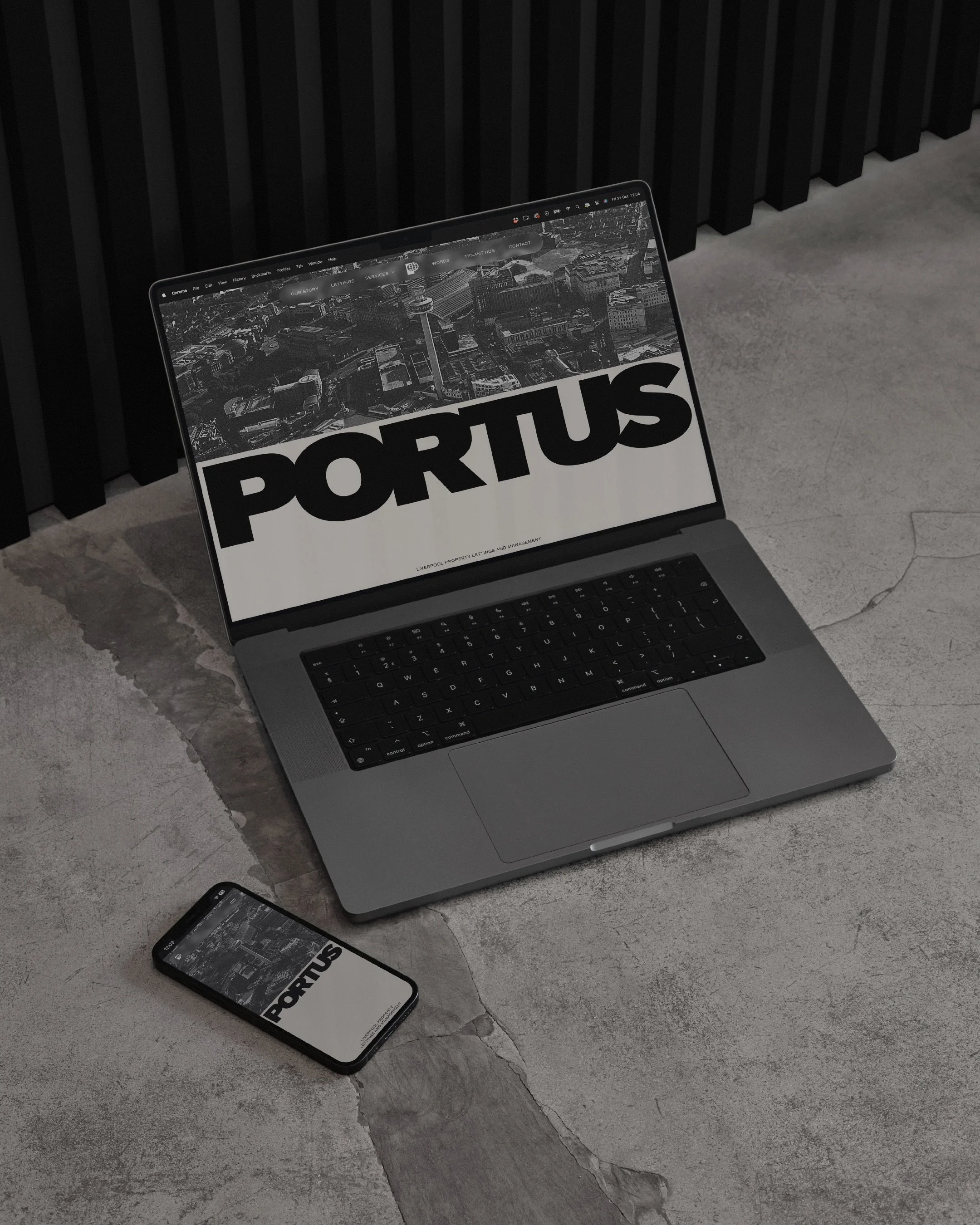
Portus came to us with a strong reputation and a clear point of difference — a people-first lettings agency built on honesty, clarity and doing things properly. Our role was to BUILD ON THAT that foundation, sharpen the narrative and develop a confident identity that reflects the way they actually operate day to day.
This brand celebrates the essence of city living, both urban and suburban. The aim was to create a brand that sat completely outside the realm of a letting agent through powerful type, bold layouts and colour choices and imagery that felt intrinsic to liverpool.