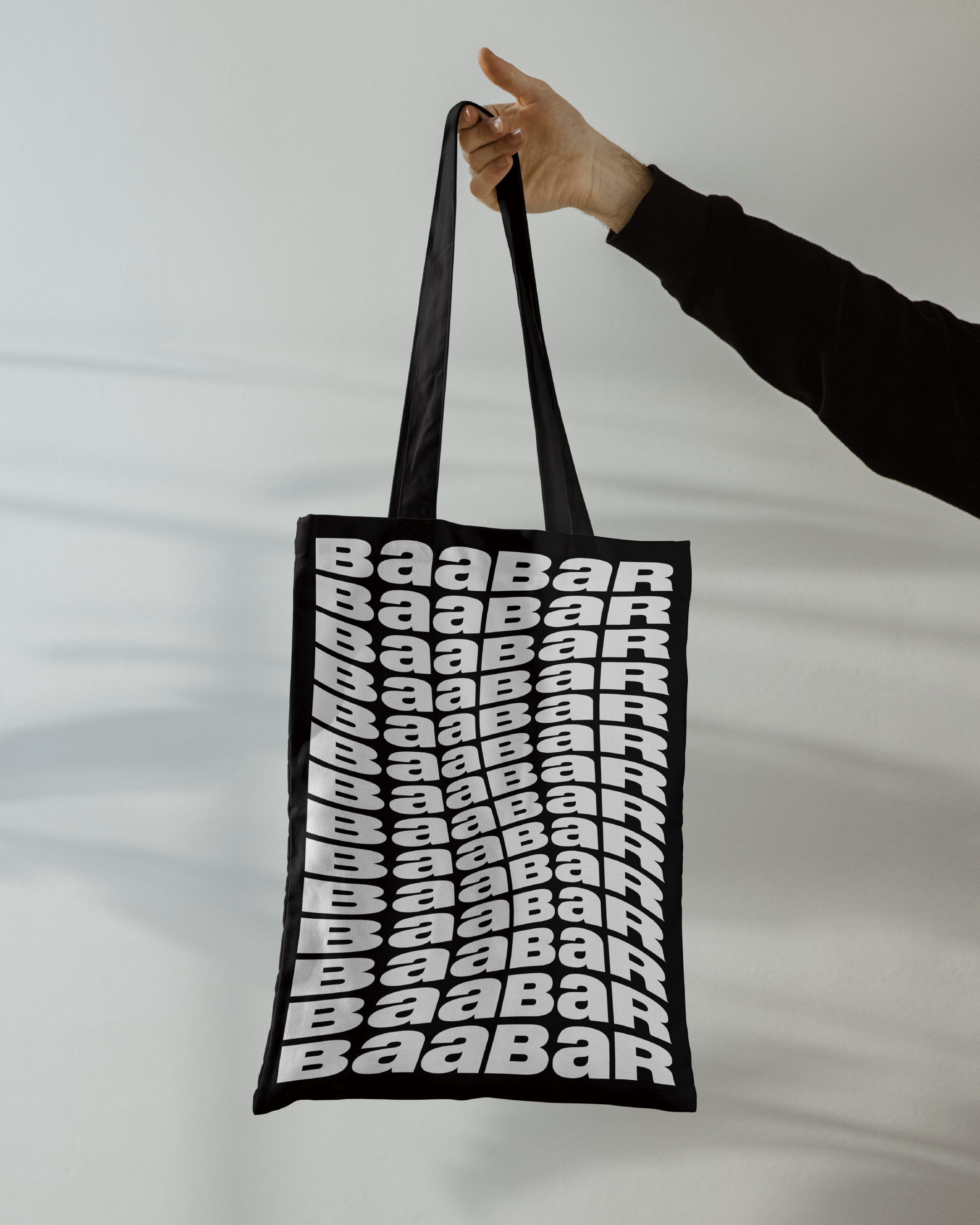
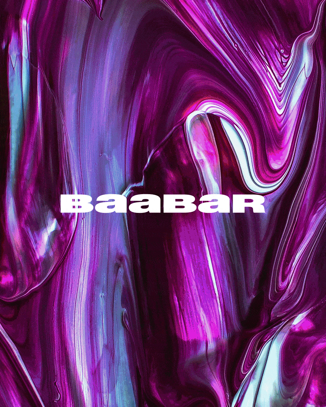
BAA BAR
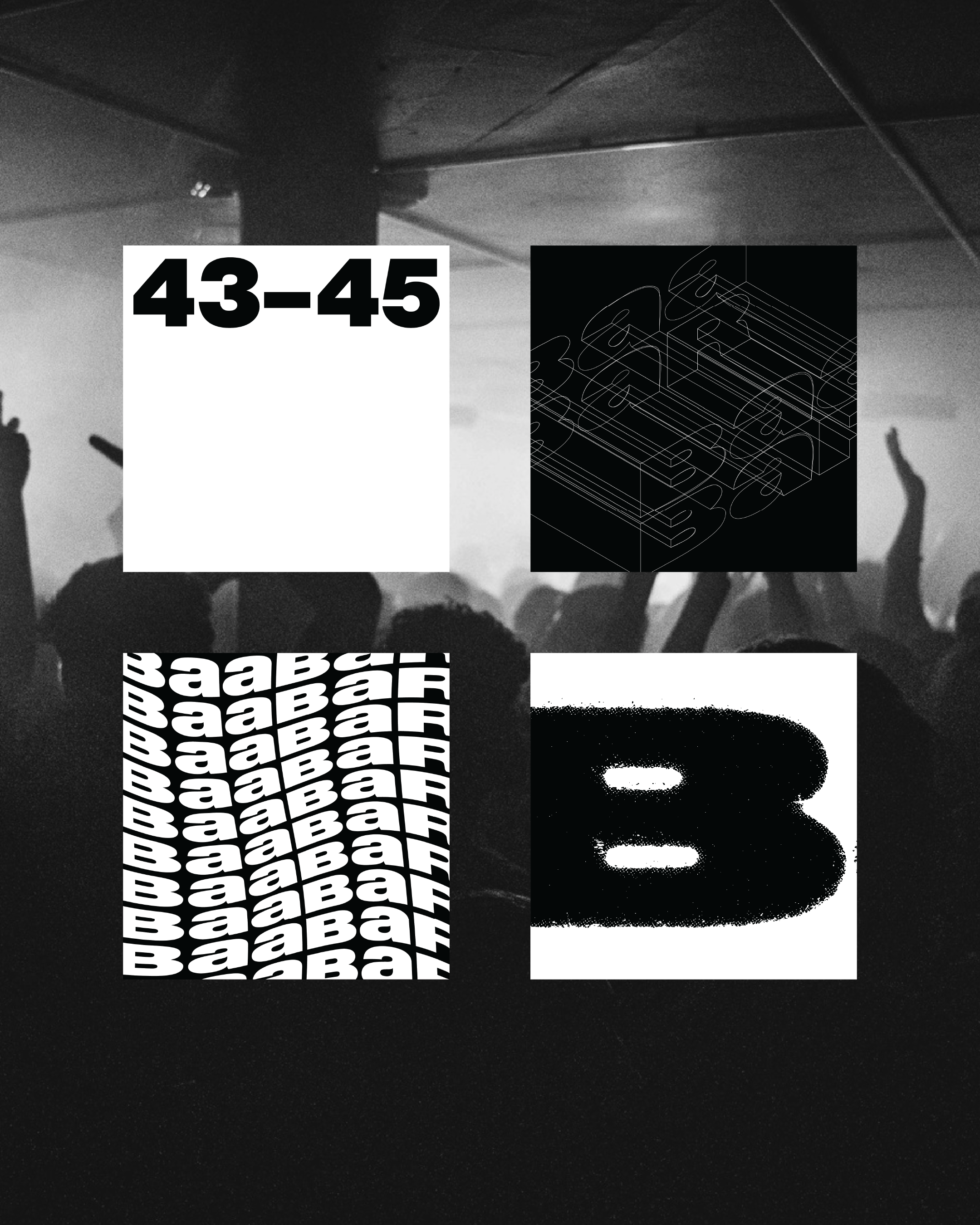
BESPOKE LOGOTYPE
Visual Identity
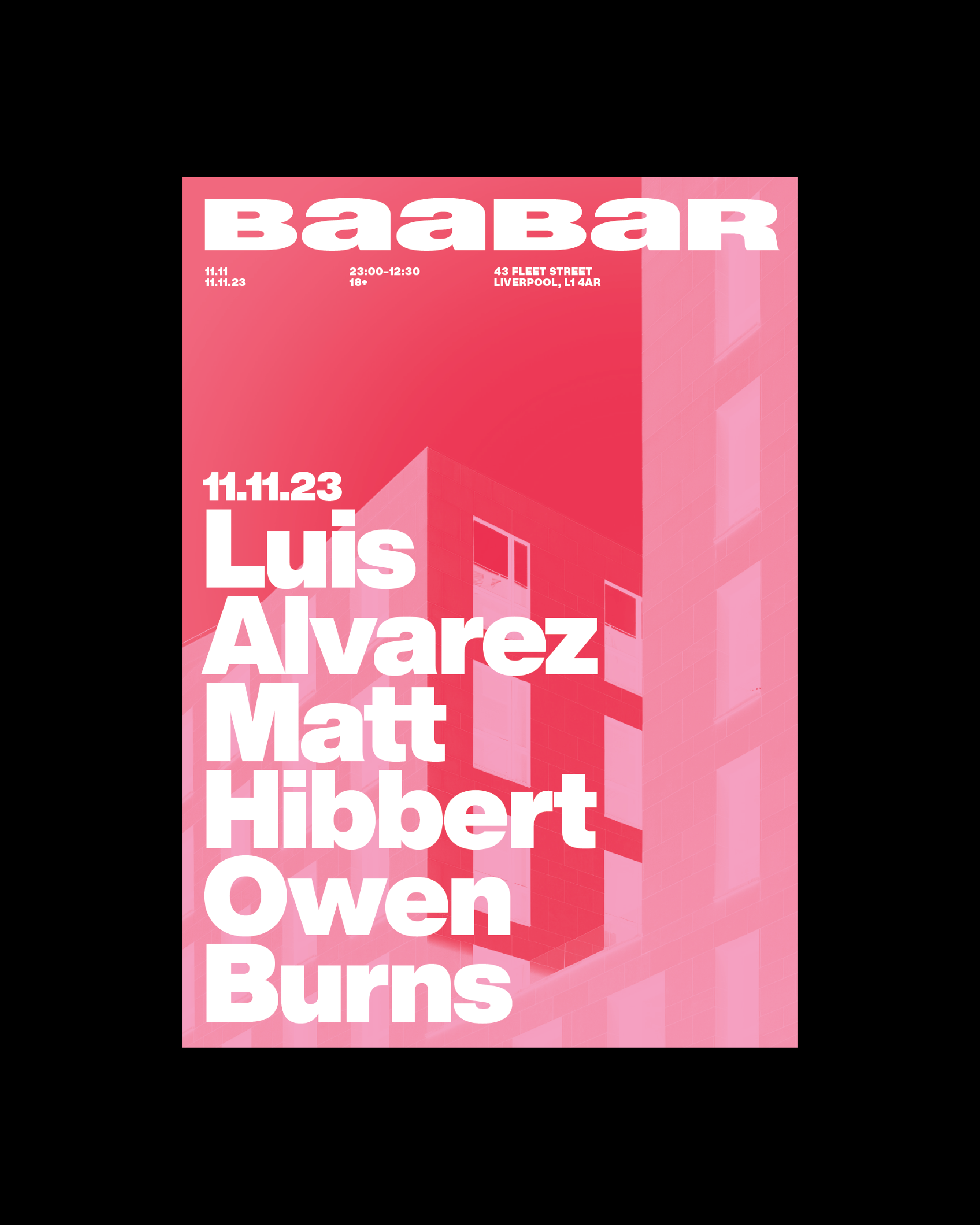
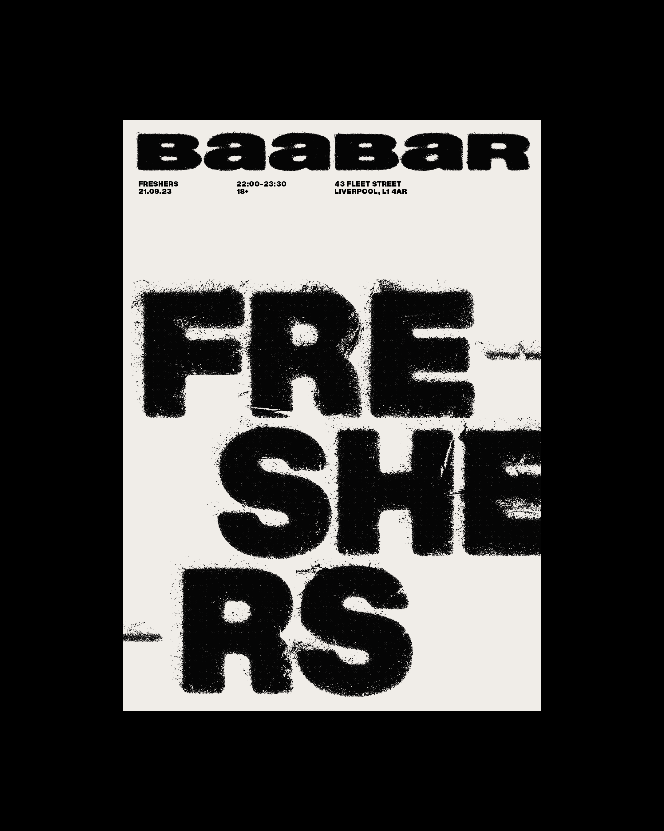
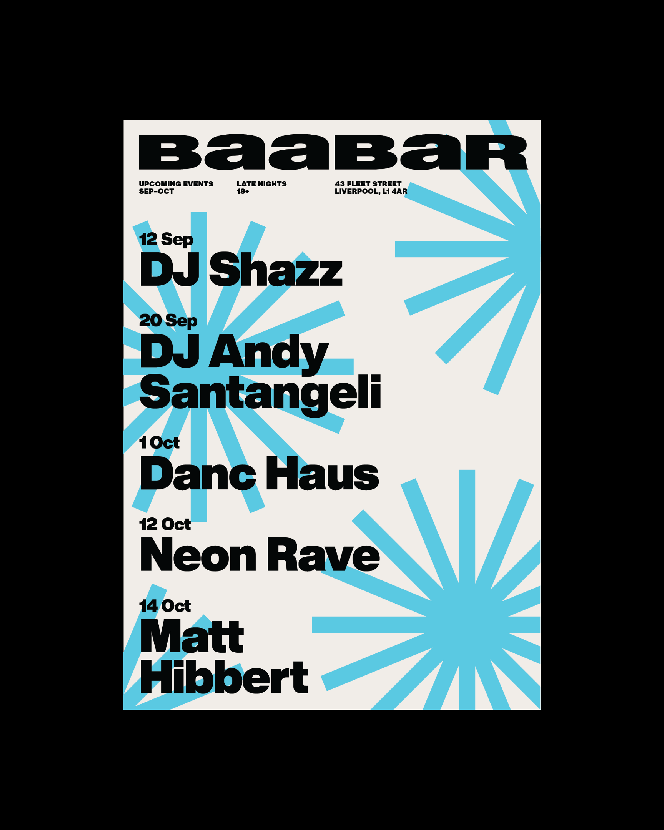
TYPOGRAPHY
COLOUR PALETTE
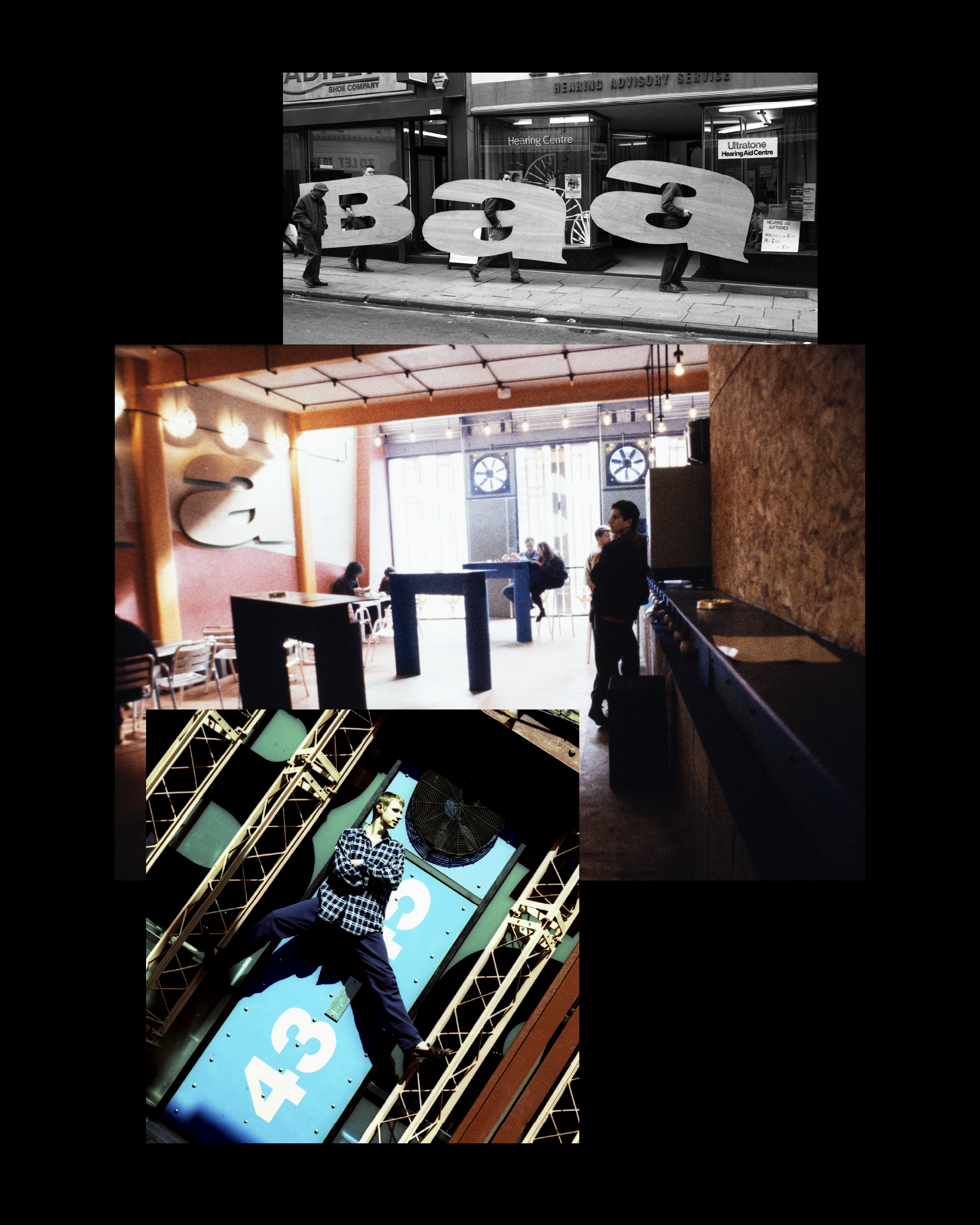
Established in 1991, the venue built its reputation on bold energy and a distinctive identity that, over time, had begun to lose focus. Rather than starting with trends or competitors, started with its rich history. We stumbled across an old photograph from Baa Bar’s opening year that captured the attitude and clarity the brand was originally known for.
That image (taken by the incredible @markmcnulty) became the starting point for the new identity. Analysis of the original lettering revealed a stretched use of Helvetica Black, rooted in the typographic culture of the early 90s. Reconnecting with this typographic DNA made perfect sense and has pushed the venue to be its best and most authentic version of itself yet.
ARCHIVE IMAGERY by MARK MCNULTY.